Puritan's Pride - For The Everyday
Puritan's Pride UK has recently attracted a new and younger target audience. The brief objective was to give the current site a revamp, making it look younger, catering to the new consumer age range of 25-35. The ask was to revamp the website with an updated toolkit, create some evergreen photography, as well as a brand awareness video.
When it comes to our health, it isn't just a one and done. We know that everyday habits have to be committed over a long term, to reap the benefits. But sometimes life gets in the way. We wanted to market Puritan's Pride as a brand that you can trust, to help you reach your health goals, no matter what.
High quality, pure ingredients and designed for the everyday - These values are very important within the brand world of Puritan's Pride, and so we wanted this messaging to be at the forefront of all the creative.
So how did we communicate honest health and clean ingredients? Taking inspiration from our clear and colourful product tubs, we used clear vessels, clear gels, liquids and pure ingredients, to create light refractions and depth of field, which feels pure. As the consumer values brand transparency, this was a strong theme throughout all of the creative.
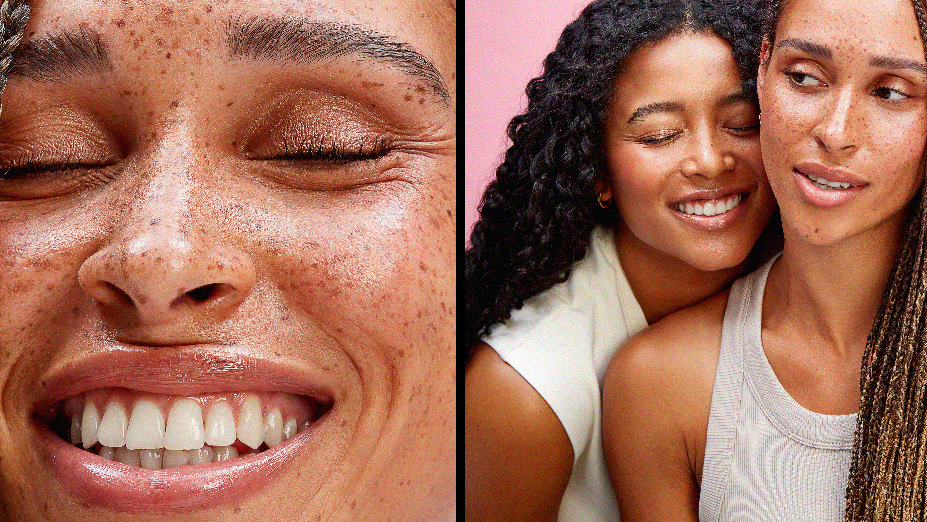
Alongside this, to reinforce the idea of how Puritan's Pride fits into your daily routine, we created some classic and authentic lifestyle imagery, capturing everyday moments. Both styles of imagery needed to have an elevated feel to them, representing the high quality ingredients that are in the products.
How do the still life and lifestyle imagery work together? Due to Puritan's Pride products being very vibrant, we wanted to bring this through in the set styling. By injecting colour coordinated props which match the product tubs, this compliments the same colours used within the still life set, allowing the imagery to gel well together.
