BEAUTY THAT FEELS GOOD
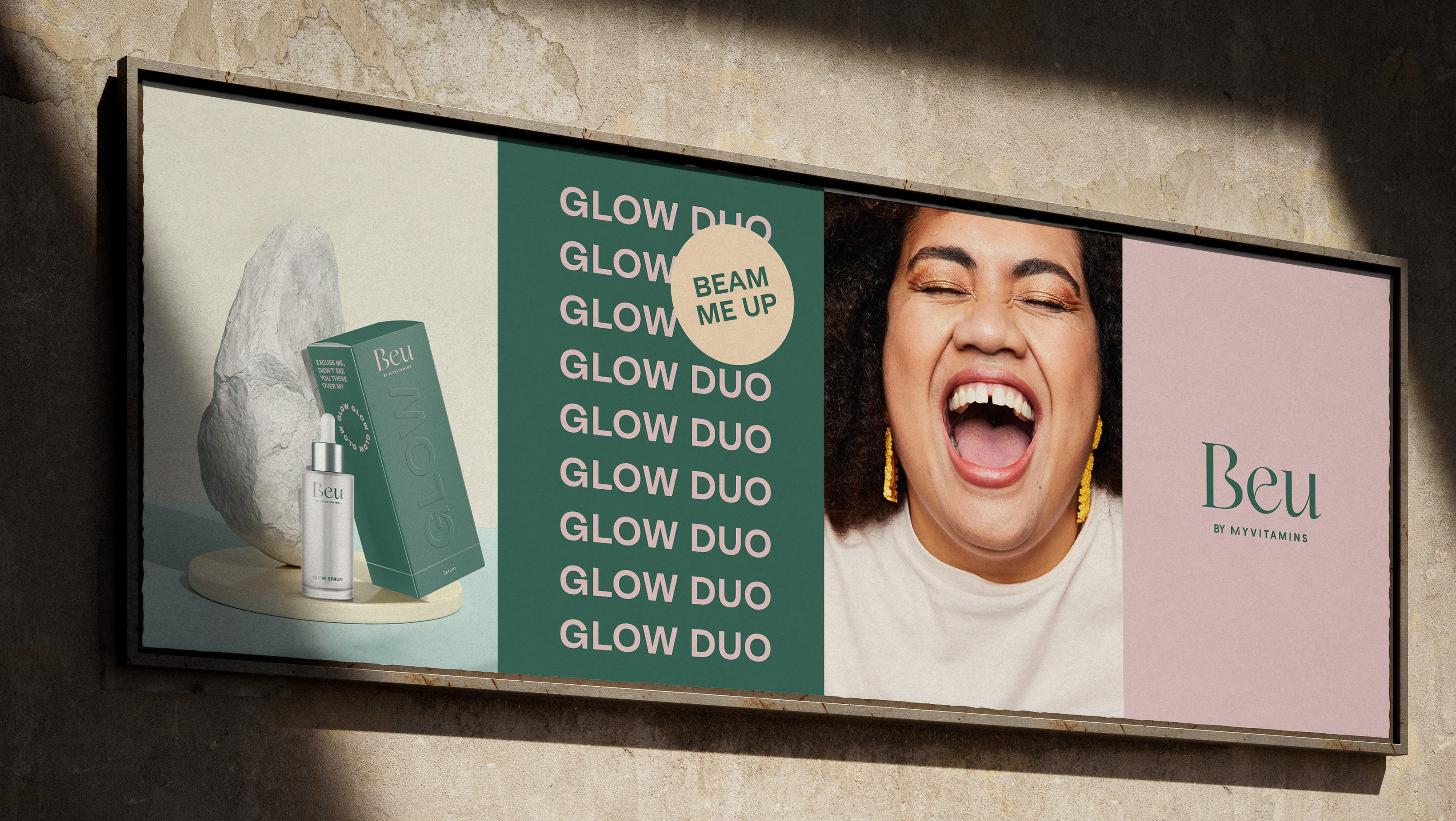
Meii is a nutri-beauty brand for the person who not only understands the relationships between caring for the body and the mind - they actively seek mind-body balance. The holistic brand exists in a rich new world of beauty that feels good. When you care for your body and mind, this reflection is evident on your skin. A balanced mind-body creates an outer glow.
The visual identity celebrates this holistic approach to beauty, and takes inspiration from the Chakra's alignment and and all it's emotional benefits, developing a strong and coherent visual system that embodies this idea of dualism and balance, using the circle as a graphical device.
The Sacral Chakra is located below the navel, and so this is where the positioning of the circular graphical device is positioned on the packaging.
BRANDING
CONCEPTUAL THINKING
ART DIRECTION
PACKAGING
DESIGN
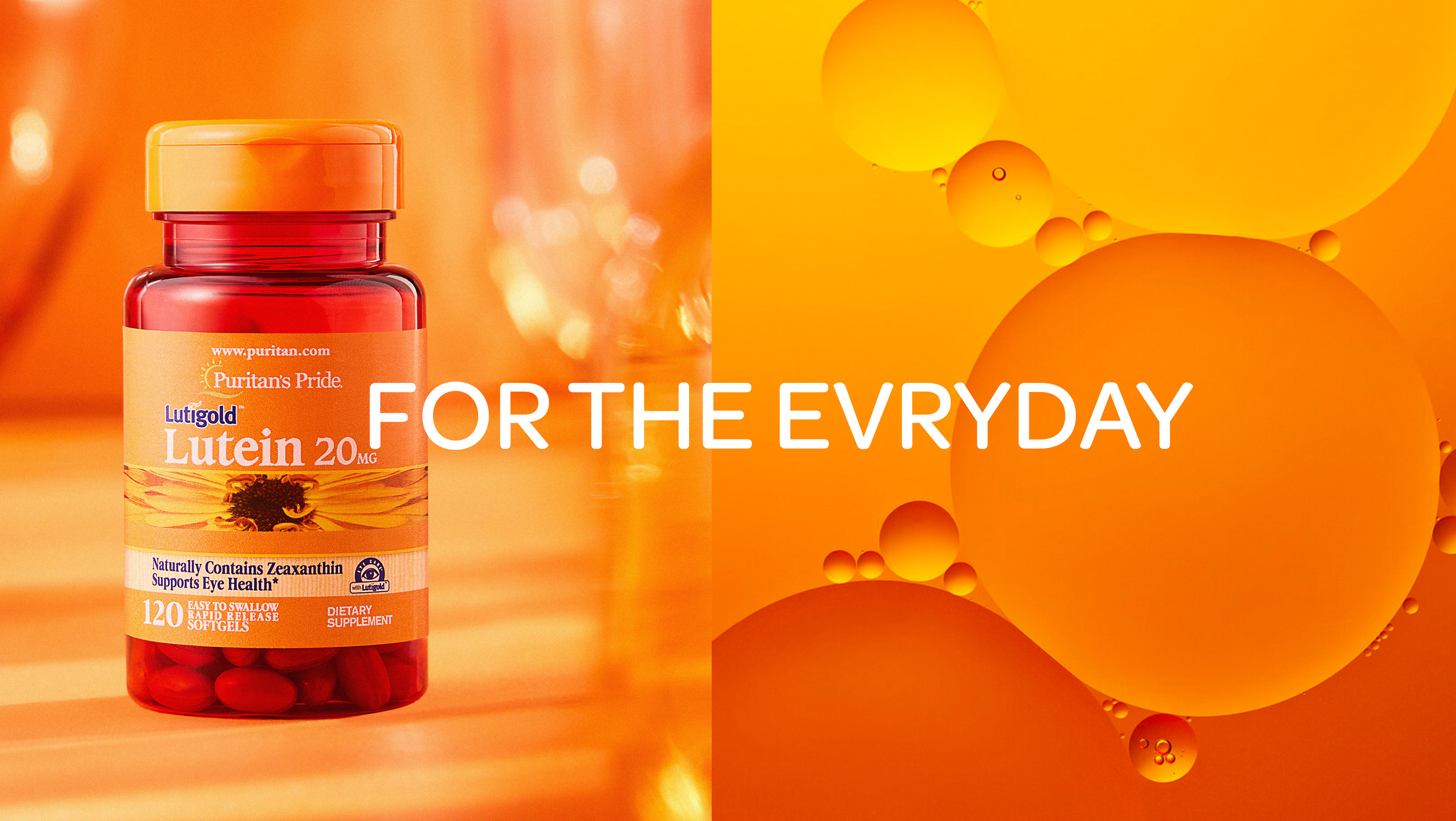
Meii’s packaging identity is defined by the vibrant pop of orange and the detailed typography. Positioned on the bottom of the box is a circular die cut, revealing the orange, representing internal feel-good emotions. The packaging consists of two layers; the outer box symbolises the body while the inner layer represents the mind. As you open up the box, the vibrant orange colour is revealed..
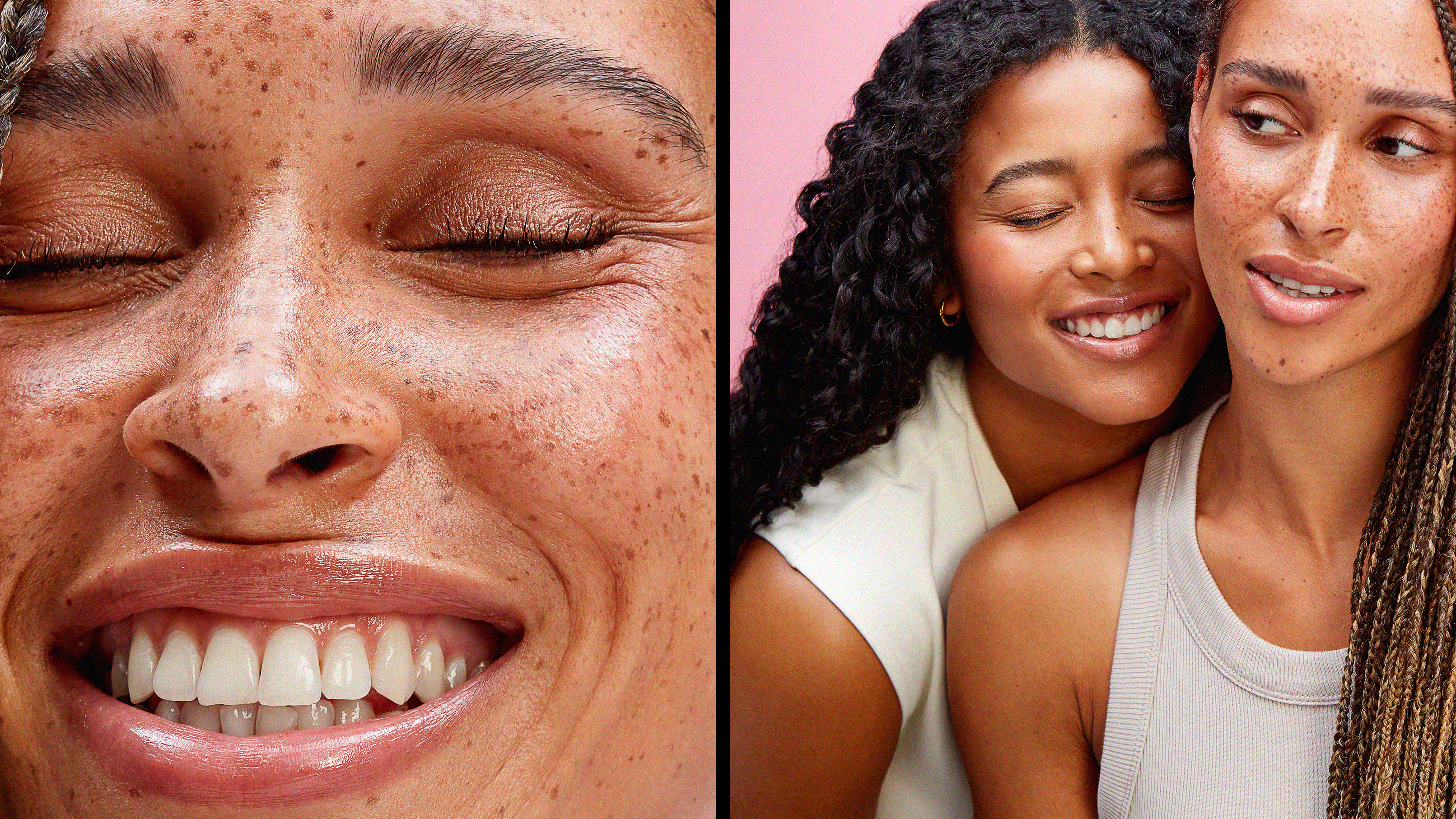
The photography represents the brands ethos, with the idea of duality at the heart of it.
Close-up shots of the face will be used to represent the emotions and the 'mind'. Close-up shots of the body, with the product intertwined and balancing on the different body parts, represents a real connection between the body and the product.
Close-up shots of the face will be used to represent the emotions and the 'mind'. Close-up shots of the body, with the product intertwined and balancing on the different body parts, represents a real connection between the body and the product.
