Unapologetic Beauty
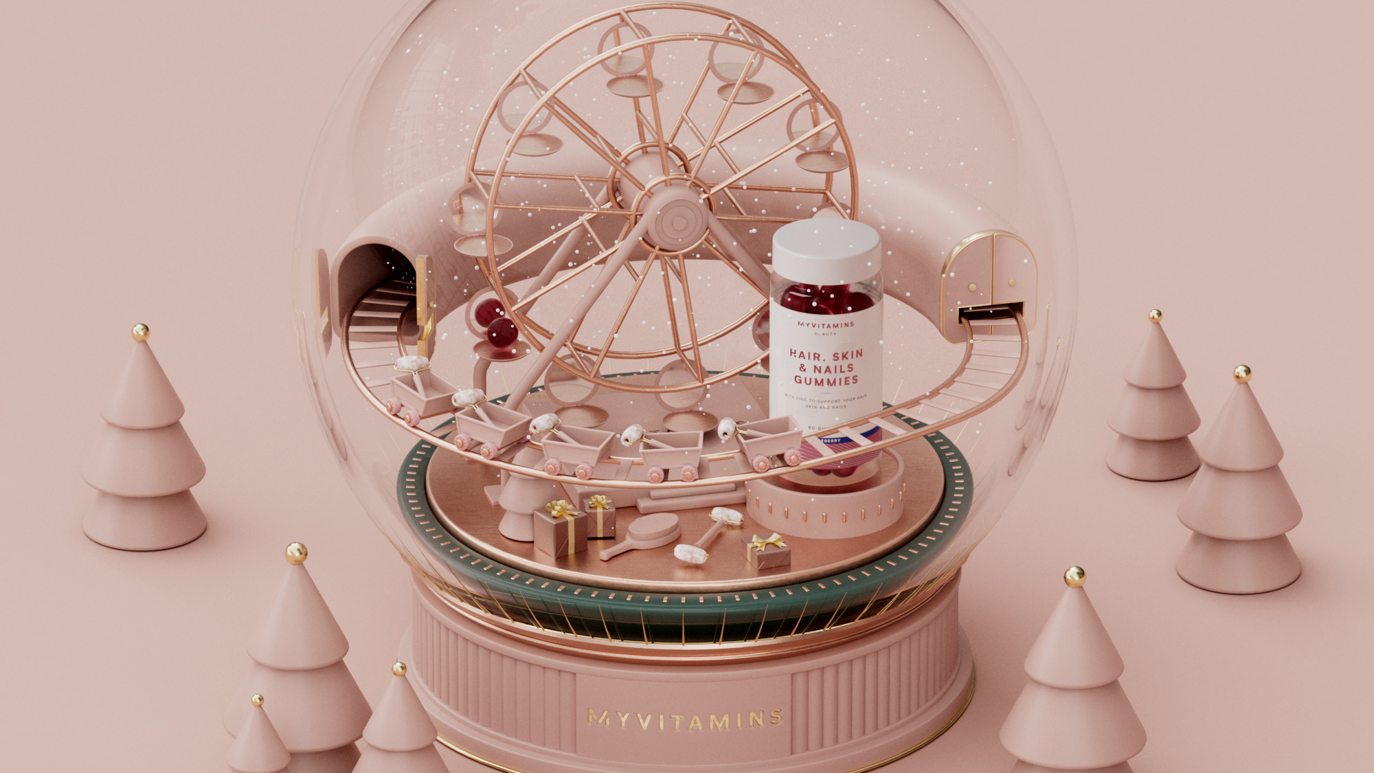
The aim of the brief was to place Myvitamins Nutri-beauty firmly in the beauty space, essentially creating the feel of a beauty product, rather than a vitamin product.
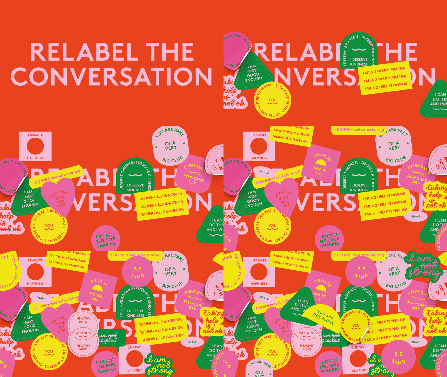
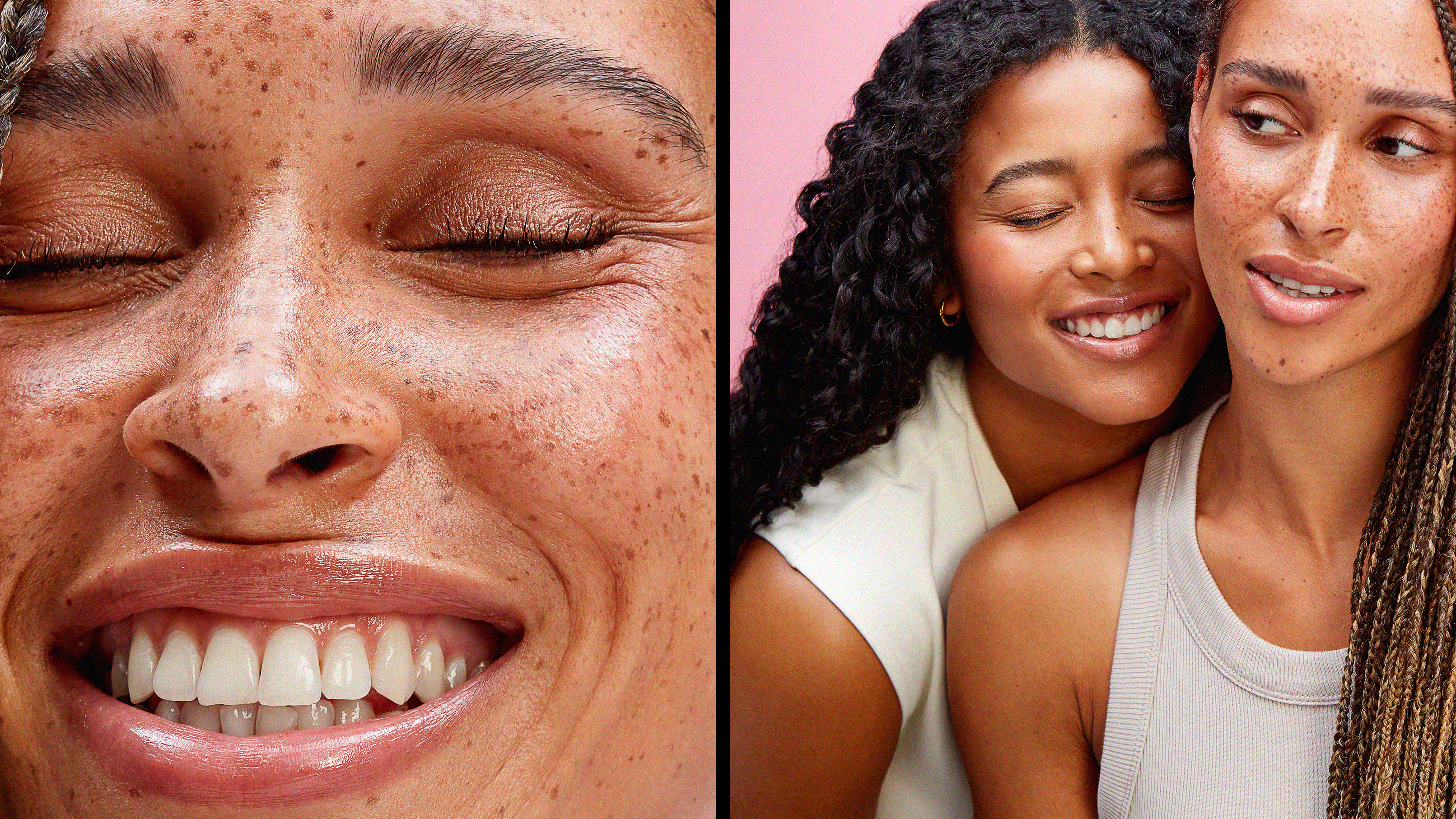
Beauty is so much more than skin deep. It's who we are that makes us beautiful. Our quirks, our personalities and our individuality. We no longer fit in one box of what is beautiful. We're unapologetically diverse, empowering everyone to express their own bizarrely unique beauty.
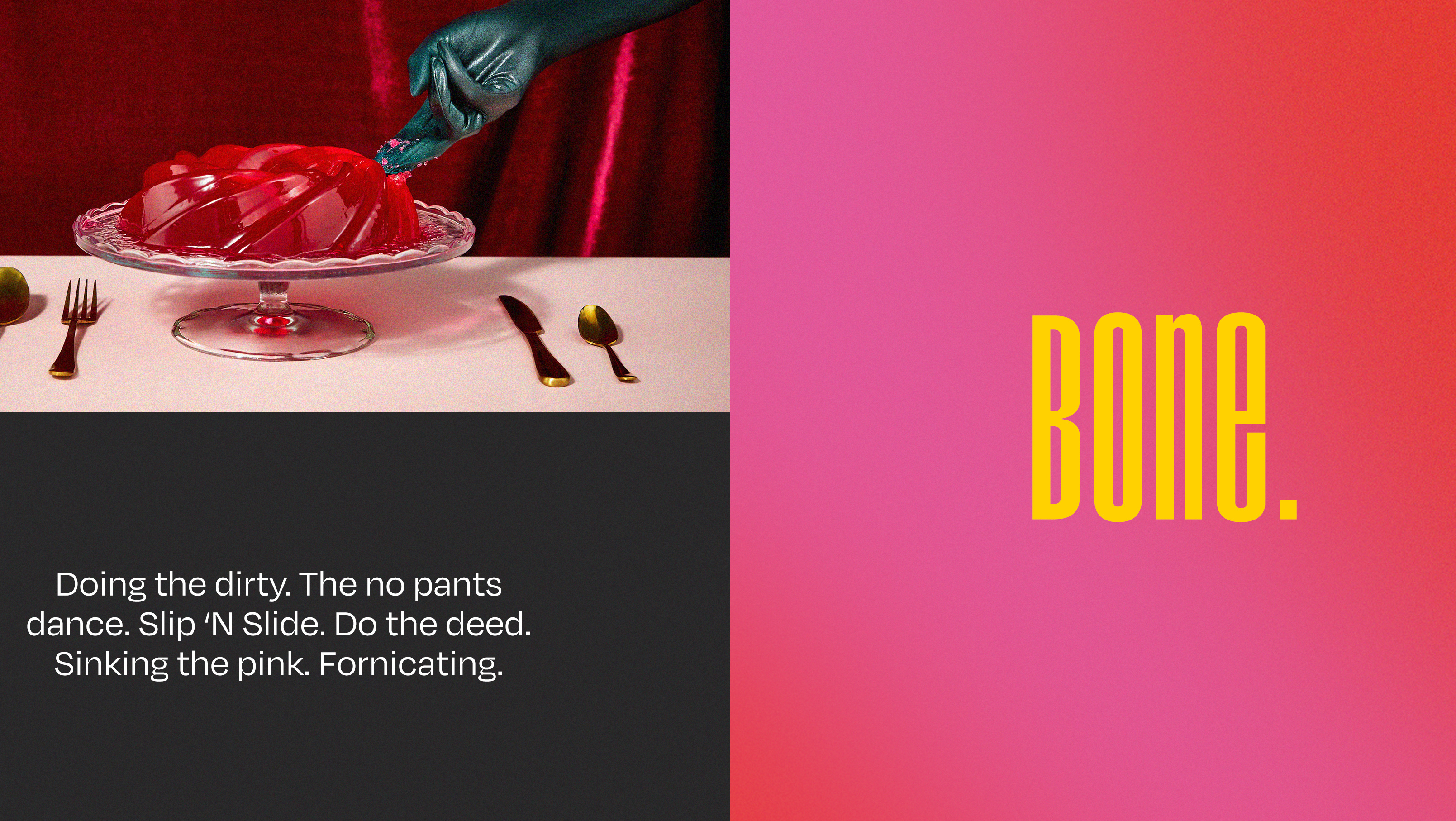
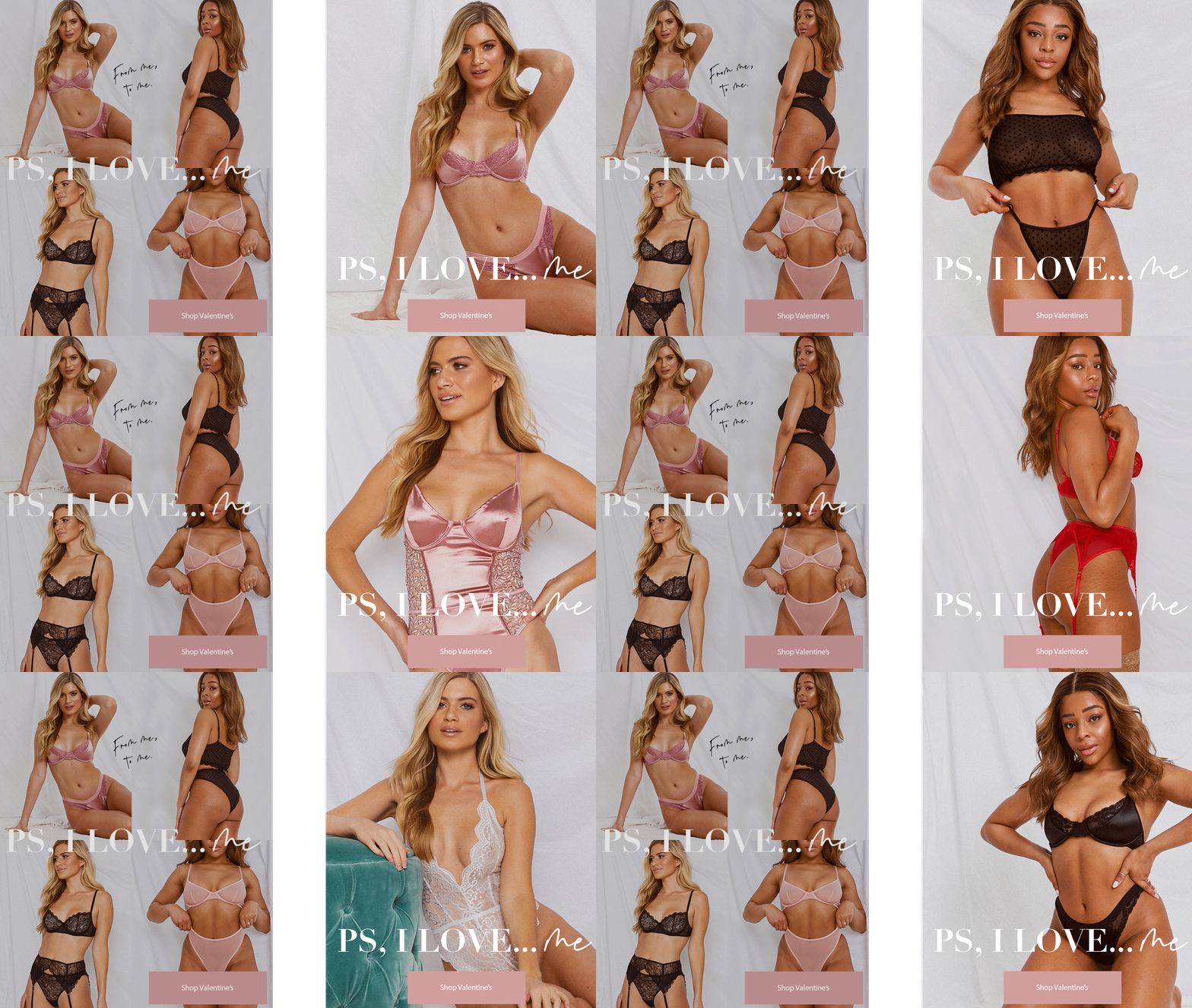
We are tongue-in-cheek, bold and daring. Confidence and expression are core to the brand personality, with TOV taking on a real, straight-talking approach.
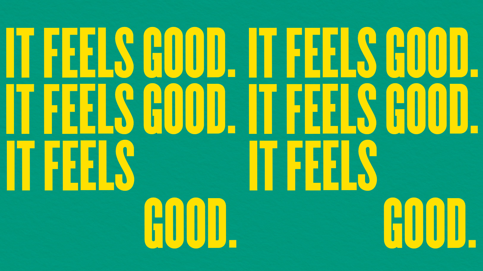
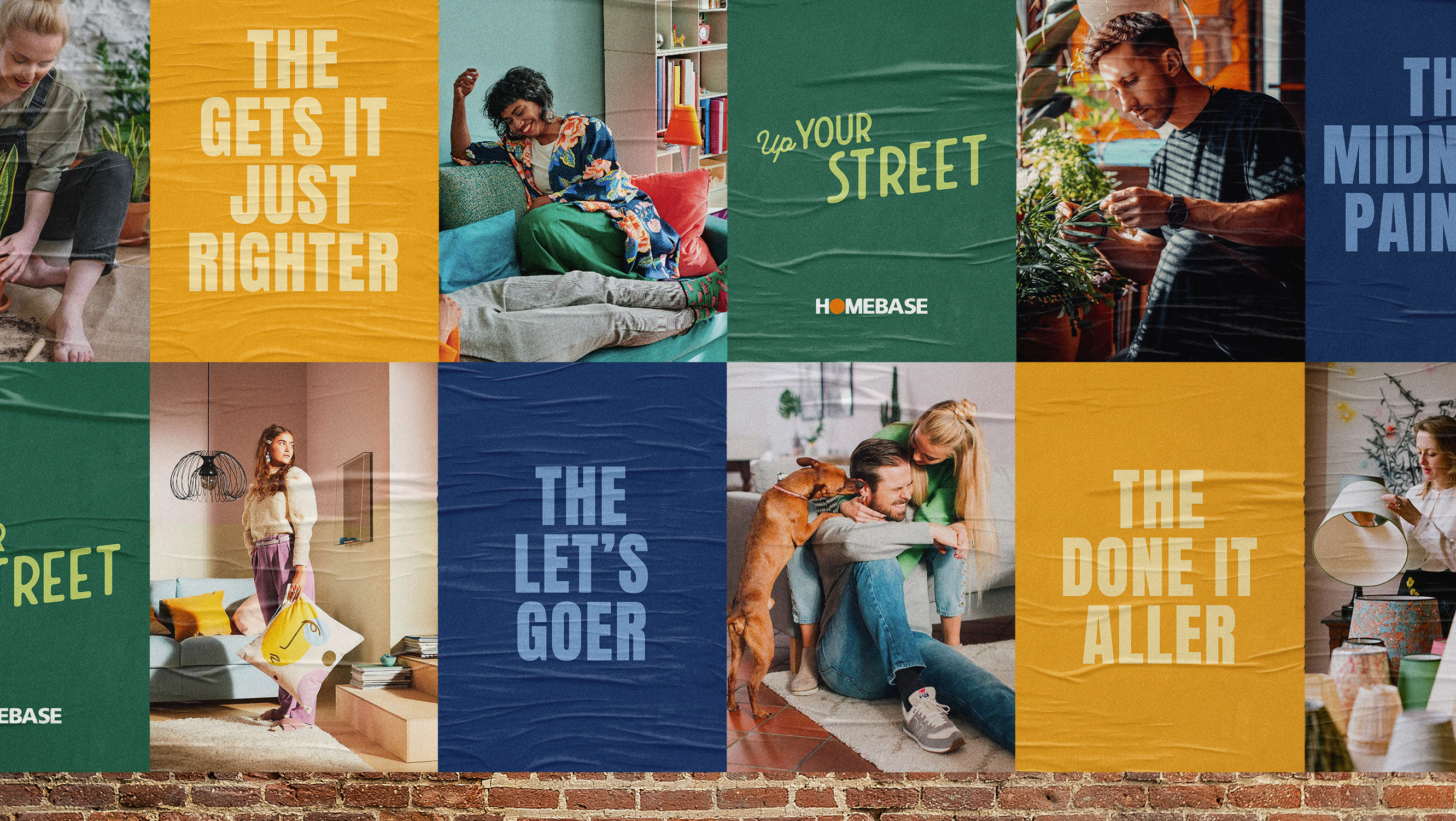
The bold type layout represents the bold messaging. It's where we get playful, fun and expressive - designed to represent how everyone is unique in their own way. The use of kinetic type expresses individuality within the design, but also does what it says on the tin. If we want to represent the idea of "plumping", then the typography will look plump. Simple.
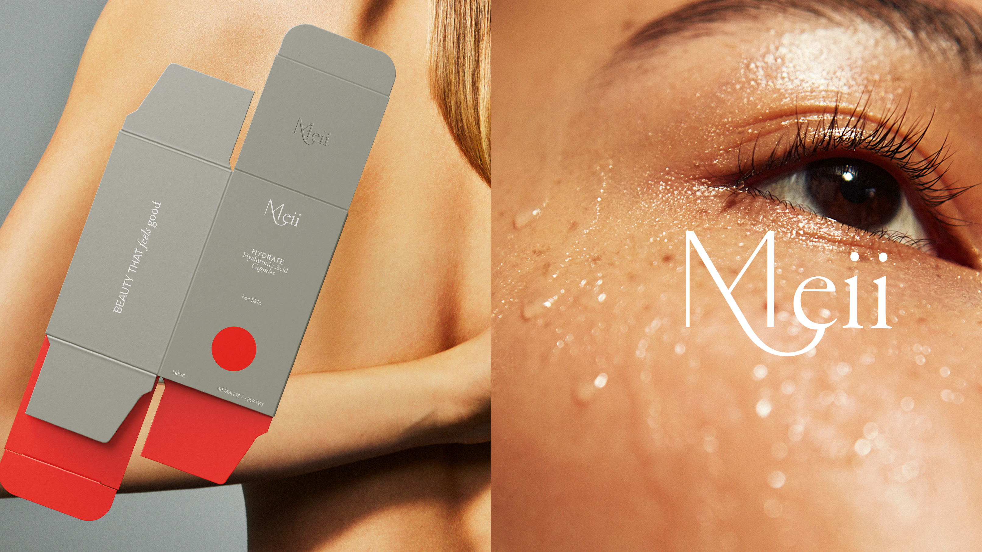
The packaging gives us the opportunity to sit the brand in a premium space. Little touches such as heavy card, blind embossing, metallic foils and frosted glass bottles. It's simple to reflect sophistication while letting the playful copy element be the star.
No two packages will be the same. Every product will be unique, much like our personalities. Each piece of packaging will have it's own individual tongue-in-cheek line of copy.
